benjamin Haswell
Eye Tracking the User Experience
The following webpage highlights the results and takeaways of a UX study conducted in the Fall of 2022 under the supervision of Miami University professor James R. Coyle.
The study was conducted after weeks of learning about the valuable role of eye tracking and other biometrics such as galvanic skin response (GSR) in the field of UX research.

Why use Biometrics during UX Research?
To Get The Full Story
While standard methods of data collection in the field of UX such as user interviews, A/B testing, and usability tests remain highly effective for different research outcomes, they tend to come from the participant's conscious thoughts and opinions, leaving a small (sometimes large) degree on uncertainty of their unconscious and true behaviors. At its very worst, this results in false or purely inaccurate data.
Tracking and analyzing biometric data from study participants can indicate and ensure that the data and research findings line up with true and natural user behaviors, picking up on otherwise lost data in natural reactions in the participant's subconscious and using it to infer on each interface's usability most accurately.
This was the philosophy my team and I approached in our own study, asking participants to complete several relevant tasks on multiple interfaces and voice their thinking during and after each task to gather as much qualitative data as possible before their biometrics were analyzed.
Research Design
The research my team and I conducted over the semester was split into three different studies:
Elite Daily Homepage: Formative Study
A close analysis of user behavior and interaction with media company Elite Daily's homepage. We asked users to navigate through the page, completing various tasks designed to reveal areas of poor usability design and presentation of information, supporting this information with the eye tracking data we collect to draw conclusions and form critiques of various design choices of the page.
Sephora & Ulta Beauty: Summative Study
A study designed to reveal which of the popular beauty sites (Sephora and Ulta Beauty) displays superior usability and presentation of information. Users were asked to complete identical tasks on the order page of a single product for each site, revealing the faults in each site, weaknesses in the interface as revealed by eye tracking, and ultimately comparing the results to determine superiority.
Reese's Super Bowl Ad:
Facial Expression Analysis
A facial expression and GSR data analysis of participants' reactions to the 2020 Reese's Take-5 Bar Super Bowl Advertisement. GSR measures microscopic releases of sweat glands on the skin when an emotional response to a stimulus occurs. We would use this kind of data to draw conclusions about the effectiveness of the advertisement in its designated purpose and what kinds of instinctive reactions viewers have to the content.
Elite Daily Homepage: Formative Study
Research Tasks
To gather valuable information, we asked our participants to:
1)
Find what is trending currently and read off a title from the trending list. Let me know what you think of this section?
2)
Locate the astrology section on the homepage and tell me when you find it. Tell me what you think of the section.
3)
Locate the fall section on the homepage and tell me when you find it. Tell me what you think of the section.
4)
Go to the menu section on the homepage, look through it and find the food button. Let me know what you think about the menu?
We also asked users a series of post-session questions, asking for a more broad overview of what they thought about the site as a whole and what their final impression was.
Why These Tasks?
Our team concluded that these tasks would encapsulate the problem areas (called AOIs - areas of interest) we identified during our initial speculations, looking to confirm our own struggles with the interface with accurate data.
Study Results and Findings
1)
The Homepage Demonstrates Poor Scannability of Information
Trending List Mayhem
All five study participants reported a struggle to read a title from the constantly moving trending section. The video to the right displays this first hand, as participants either have to wait for the full title to be readable or begin reading a title but lose the rest of it to the edge of the screen.
Automatic Dropdowns
Alyssa, one of our participants, reported that the automatic

dropdown feature of the menu was disruptive and made the items harder to read. Other users' sporadic eye movements upon the opening of a title indicated a similar sentiment, but they never expressed it verbally so our team decided to keep it as cautious evidence.
Participant Quotes
“It was easy to find but I also don’t like that it stacks up and that it’s moving because when I was trying to read, they were already gone.”
- Alyssa
“I think it is way too much, especially moving in opposite directions" - Brianna
“This is a lot harder to read than Twitter’s Trending List” - Jackson
2)
Elements are Placed in Unexpected Locations
Astrology Confusion
3 out of 5 of our participants demonstrated an initial target comprehension error in locating the small astrology section on the page, scrolling past it and reporting a confusion about whether or not it was the section they were supposed to be looking for due to its inconsistency in placement compared to other sections.
Misplaced "Food" Button
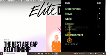
The most universal piece of evidence (even in our class) was that the "food" button in the menu section was not in the section people would expect it to be in. As the video details, multiple people disagree with the placement of the button, indicating that they would instinctively look towards either "experiences" or "entertainment" before considering the "news" section.
Participant Quotes
“Now I feel stupid” - Jackson, trying to find the "food" button
“I would not expect to find ‘Food’ under the news section. I would expect to find it under ‘Experiences’ or ‘Entertainment’ sections before ‘News’” - Brianna
“This looks like the astrology section, but I don’t know, I am gonna keep scrolling” - Alyssa
In Conclusion
Our team was satisfied with the data we collected. As formative studies naturally go, the bulk of our supporting data was qualitative, gathering insights from the participants verbally. However, we were able to further support and confirm their claims with their eye tracking behavior, gaining deeper insights towards the problems faced by Elite Daily's Homepage.
Sephora & Ulta Beauty: Summative Study
Research Tasks
To compare the two product pages, we provided our participants with the following tasks:
1)
You have a concern about the product you want to settle before you consider ordering the face mask. Locate where you would ask a question about the product and tell us when you’re done.
2)
Now you want to know what the contents are in the product. Look around the page and find the contents list. Feel free to click where you see fit and tell us when you’re done.
3)
You are interested in seeing pictures from customers who have used and reviewed the product. Locate the product reviews with pictures and tell us you’re done.
4)
You are interested in purchasing Glam Glow for your skin; however, you don’t have the $60 upfront to purchase it. Locate where you would find financing options for the product; tell us when you’re done.
Once these four tasks were completed, we asked users to scroll through the page one last time and provide a score out of ten based on how cluttered they think the page is, one being not at all and ten being extremely.
Why These Tasks?
These tasks encapsulated core actions users would normally perform if they were to be purchasing a product from an online store. This would provide a strong control group to more accurately compare the design choices of each site.
Study Results and Findings
1)
Ulta Beauty Displays Superior Target Findability
One Less Failure
Recognizability Error
On Sephora, five out of five participants scrolled past our AOI - the "ask a question" button at the top of the page. One of our participants was able to locate the identical AOI on Ulta, taking eight seconds to do so. The video above demonstrates her finding it, and the other participants failing to do the same on Sephora.
In a similar vein, all users were able to locate alternative financing options on Ulta, with one less success on Sephora. Her eye tracking data demonstrated a scanning of the AOI, but a failure to recognize it as the target, moving on to a different element on the page and confusing it for the target.
2)
Sephora's Presentation of Information is One Step Ahead of Ulta
Even though Ulta demonstrated superior target findability, the eye tracking data demonstrates Sephora as laying out information in a smoother and more intuitive manner.
All five of our participants struggled to locate the "reviews with pictures" on Ulta.
We attributed this struggle to the head-scratching design choice of hiding all the reviews with pictures in the reviews section, and then putting the button to reveal these reviews in an unexpected dropdown menu.
There are two dropdown menus in this section, one labeled "Most Recent" and the other labeled "All Reviews". Typically, you would expect the filtering out of results to be in the latter, not in this case.
This is especially detrimental to the user experience, as looking at pictures is an important part of the customer decision to purchase a face mask. This design choice is a direct contradiction of that need.
The video above demonstrates one of our participants scanning through the desired menu, but failing to recognize the final option as the target, further emphasizing the point that Ulta's presentation of information is inferior to Sephora - she still wasn't able to find the target, even after selecting the misleading dropdown menu.
In Conclusion
Though the product pages for Sephora and Ulta were both similar in design and layout, being able to find specific areas of difference and confusion has highlighted the capabilities of eye tracking as a whole, being able to reveal insights that would otherwise be hidden or almost impossible to come to based off pure conjecture.
Reese's Super Bowl Ad: Facial Expression Analysis
We asked our participants to simply watch the embedded 2020 Super Bowl advertisement. To gather qualitative data to support the GSR and facial expression readings, we asked these three post-session questions:
1)
Tell us what you thought about the commercial.
2)
What was your favorite part?
2)
How did you feel while watching it?
Ad Summary and Expectations
The Reese's Advertisement is a series of gags which play off of common sayings, arguing that people who haven't heard of the "Reese's Take-5 Bar" must be 'living under a rock', and 'born yesterday', showing people literally following these sayings in a corporate office. Our team was expecting an overwhelmingly positive reaction to the ad, as there were several parts we found amusing. Our main prediction, however, was that the final joke (insinuating somebody with their 'head up their a**') would evoke the strongest emotional response, as it is implied rather than verbalized like the rest of the jokes.
Results and Analysis
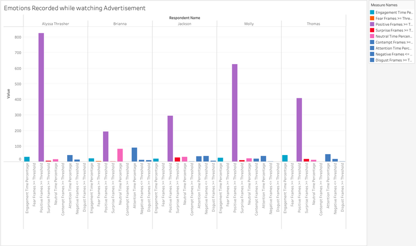
As anticipated, the video produced an overall positive emotional response from all five participants as shown in the facial expression analysis.
Unexpectedly, however, the final joke did not end up being as popular and emotionally evoking as we anticipated, as only one participant reported it as being their favorite of the jokes.
The GSR data also supports the hypothesis that the video loses some of its humor as the video goes on, as the average initial GSR peak across the participant was at the first joke, indicating that once people understood the general premise of the video, it wasn't as funny as more and more jokes were said. One of our participants reported that she didn't even understand the point of repeated jokes at all:
Aside from these unexpected results, however, both the quantitative and qualitative data showed that the advertisement succeeded in its goal of being amusing and evoking a positive response.
Alyssa
"I didn't get the naming different things"
The video above demonstrates participant reactions to the video, gathering facial expression analysis data (above) and GSR readings (below) as it plays.
The graph to the right demonstrates the number of frames per emotional reading from each of the participants, "positive" being the overwhelming winner.

In Retrospect: Successes and Challenges
Overall, our study was greatly successful - my team all felt like we had collected valuable and insightful data, and were able to use it to make valid and supported claims about the various interfaces we focused on.
I can confidently say that the most challenging part of the process was compiling and organizing our data. After the sessions, we were left with over 1.03 gigabytes worth of gaze replays, GSR recordings and spreadsheets, voice recordings, and other forms of data we gathered, all of which we needed to sort through and connect together to draw accurate conclusions.
In retrospect, however, this process was very helpful for my professional growth, as I took it upon myself to divvy up the work amongst my group, assigning everyone a set of tasks to complete each period to work most efficiently in the time crunch we were facing.
I was also lucky enough to work with a very cooperative and passionate group, as we found many times outside of class to work together on our projects, managing to have a good time doing so in the process.
The study taught me valuable lessons for working as a team, how a large scale research undertaking is executed in a realistic setting, and how much more insight the implementation of biometrics can have on a user experience study. It was a very challenging, time consuming, but ultimately rewarding experience, and I am infinitely grateful that I had the opportunity to execute it as I pushed further into the world of emerging technology and interactive research.

Photograph of Laws Hall, the primary site of our study.